We saw the general design of Sony PS5 boxes a couple of days ago. Some players didn’t like this design. The PS5 boxes were expected to be more attractive but we saw the traditional blue box with white ground above and PS5 logo on it.
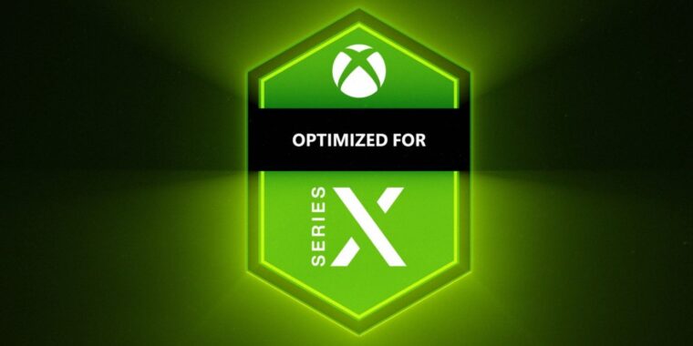
Afterwards, Microsoft shared the designs of Xbox Series X game boxes and according to the comments made since then, we can see a clear dissatisfaction. The reason is neither color nor design, but the ‘Optimized for Series X’ label used.
These new boxes are similar to the Xbox One boxes; at the top, there is ‘Xbox’ instead of Xbox One on the green floor. Features such as Smart Delivery support, HDR and 4K Ultra HD are shown on the front cover image. But there is also a huge Series X label.
This label is not compatible with the rest of the box and it doesn’t look well. Moreover, on the 3 images shared, this label stands at different places on the cover and this is why the covers look incompatible. As a result of the comments made, the Microsoft will probably revise this design and change something. But there is not a certainty.


